2026-09-26 · 7 min · By Alcott Dube
How to build a layout grid for columns, type and spacing
I use columns to control width, baselines to organise text, and a restrained type scale to make repeated layout decisions consistent without flattening the composition.
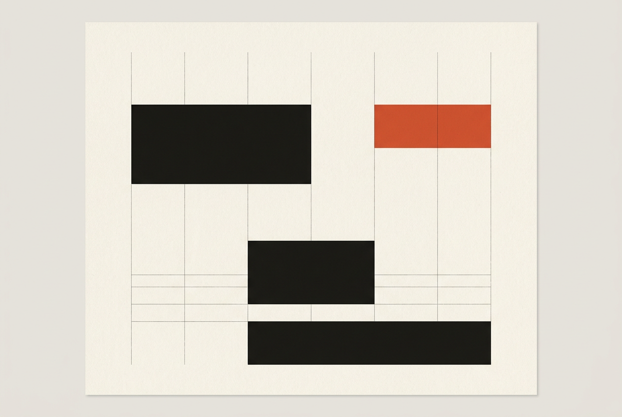
I build a useful layout grid by setting the body text first, dividing the available width into columns, and coordinating vertical spacing with the text’s line height. I then assign repeatable column spans and type sizes to content roles, so routine decisions have defaults and exceptions stay deliberate.
Choose the content before choosing the grid
I start with the awkward material: the longest heading, a dense paragraph, a portrait photograph, a short caption and a table. A grid built around an attractive opening spread can fail on page four. For a client report template, I would test the financial appendix before polishing the introduction. That is where narrow columns and optimistic spacing tend to fail.
Josef Müller-Brockmann’s Grid Systems in Graphic Design treats the grid as an organising framework rather than decoration. I take a practical rule from that: divisions need a job. If a column never supports an alignment or a useful content width, I probably don’t need it.
Before drawing guides, I identify the page size, output format and repeated content roles. I also establish who will populate the template. A system maintained by a designer can tolerate more exceptions than one handed to six editors. I keep the latter stricter, with fewer permitted combinations and explicit rules for overflow.
Calculate columns, margins and gutters
For a worked print example, I use a page measuring 210 by 297 mm with 15 mm side margins. That leaves 180 mm of usable width. Six columns with five 4 mm gutters produce columns approximately 26.67 mm wide: subtract the combined gutters from the usable width, then divide by six. I retain the precise value in the layout tool rather than rounding each column independently.
The useful widths are the spans, not the individual columns. Two columns plus their internal gutter measure approximately 57.33 mm. Three measure 88 mm. Four measure approximately 118.67 mm. I can assign a caption to two columns, body text to three and an image to four without inventing a new width for every element.
Smashing Magazine’s Building Better UI Designs With Layout Grids distinguishes column grids from other structures. I use columns for horizontal relationships, not as a complete spacing system. Six suit this example because they divide into halves and thirds. Twelve would offer more combinations, but also more opportunities for unnecessary variation.
Set body text width before fixing the template
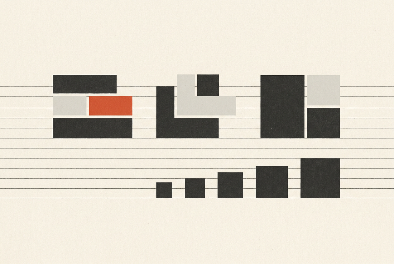
I test the 88 mm span with actual copy, starting at 10 pt type with 14 pt leading. Those numbers are trial settings, not a prescription. A wide typeface may make the measure feel cramped; a narrow one may pack too much into each line. I judge the rendered text, not the nominal point size.
For continuous reading, I use roughly 45 to 75 characters per line, including spaces, as an initial checking range rather than a pass-or-fail standard. I inspect several representative lines and read a full paragraph at the intended output size. Frequent awkward breaks, excessive hyphenation or difficulty finding the next line tell me to adjust the measure.
If the text fails, I change the column span, type size or typeface before touching tracking. Tightening every paragraph to rescue a bad width creates a second problem. For print, I check a physical proof. A page fitted to a laptop screen tells me little about whether small text is comfortable.
Build a baseline grid from the body leading
With body text settled at 10/14 pt, I set the baseline increment to 14 pt, approximately 4.94 mm. I give text frames a consistent first-baseline offset, then check that adjacent body columns share the same baseline positions. Matching frame tops alone does not guarantee that the first lines align.
I use 14 pt paragraph spacing where a blank-line separation is appropriate. A heading with 28 pt leading occupies two baseline increments per line. Spacing before and after it also needs to respect the underlying rhythm if body text below must rejoin the same grid. I check the heading block as a whole, including its first-baseline position.
I don’t force every text style onto that grid. An 8 pt caption may need 10 pt leading, especially beside a small image. I let it run independently while aligning its frame with a meaningful edge. The failure to avoid is inconsistent body alignment, not a caption that uses a different rhythm for a good reason.
Choose a modular type scale with useful roles
A modular scale multiplies a starting size by a fixed ratio. Starting from 10 pt with a ratio of 1.25 gives 10, 12.5, 15.625, 19.531 and 24.414 pt. I would round those to practical values such as 10, 12.5, 16, 20 and 24.5 pt, then test them in the chosen typeface.
I assign roles before adding sizes: body text, introductory text, subheading, section heading and page title. A sequence of mathematically related sizes does not automatically create a clear hierarchy. Weight, placement and surrounding space still matter. If two neighbouring sizes look indistinguishable in context, I remove one rather than preserving the ratio out of loyalty.
Type size and leading solve different problems. A 20 pt heading might use 28 pt leading to fit the baseline rhythm. A two-line title may need a different setting. I keep the scale as a starting palette, then record the approved size-and-leading pairs. Editors should choose a role, not calculate a ratio each time.
Use vertical modules for images and spacing
Columns and baselines still leave image heights undecided. I add a larger vertical module of 42 pt, equal to three body baseline increments. An image can then occupy four, six or eight modules according to its role. I anchor these modules to the content area and keep the body’s first-baseline offset consistent within that structure.
I do not make every photograph fit those heights. A crop that removes the subject’s context is a worse result than an exception to the module. I try another permitted height or column span first. If neither works, I preserve the image and document the exception rather than quietly introducing an arbitrary dimension.
Horizontal and vertical measurements do not have to match. The 4 mm gutter separates columns; the 14 pt baseline supports reading. Forcing both into one unit would compromise one of those jobs. What matters is repeatability within each direction, plus clear alignments where text, images and rules meet. I avoid adding subdivisions that never change a decision.
Stress-test the grid and document layout rules
I test a sparse page, a typical page and the densest plausible page. Then I replace a short title with one twice as long, remove an image and add several captions. These changes reveal whether the grid handles content or merely frames one carefully composed example. I also check full-size output, not just a spread viewed from a distance.
I record overset text, manual line breaks, one-off widths and local spacing overrides. The count is diagnostic, not a performance target. If the same exception appears three times, I would consider promoting it into an approved pattern. If most pages need exceptions, I revisit the grid rather than writing a longer rulebook.
The handover needs operational rules: body copy spans three columns; captions normally span two; headings use named styles; images use approved widths and tested height options. I include one crowded example with its overflow treatment. I would rather specify an extra page than leave someone to shrink the body text until everything fits.
Questions people ask
How many columns should a layout grid have?
I choose the smallest number that supports the required content widths. Six columns provide halves and thirds; twelve add finer combinations. A simple text document may only need two.
Does every element need to align to the baseline grid?
No. I align continuous body text where shared baselines improve the page, but allow captions and display type their own leading. Their placement should still relate to the surrounding structure.
What is the difference between a modular grid and a modular scale?
A modular grid divides space into repeated units across columns and rows. A modular scale generates related values through a ratio, often for type sizes. I use them together, but neither determines the other.
How do I adapt a print grid for mobile?
I preserve content roles rather than shrinking the page geometry. Multiple print columns usually become fewer screen columns, with revised margins and type settings. I test reading order and allow text to grow without fixed-height containers.