2026-09-17 · 7 min · By Alcott Dube
How to design a high converting landing page without shouting
I build landing pages around a clear offer, evidence beside the relevant claim, and one action that makes sense for the visitor.

I design a landing page to convert by making the offer specific, placing credible proof beside the claims it supports, and giving visitors one clear next action. I keep the visual hierarchy quiet, explain the commitment before the click, and measure qualified outcomes rather than button clicks alone.
Match the landing page headline to the visitor's intent
I start with the link someone clicked, not the layout. An advert for a fixed-price website review should lead to a page about that review, not a general introduction to a design consultancy. Before writing anything, I record the traffic source, the promise made there, and the decision the page needs to support. Those three details set the scope.
My headline names the offer and its useful result. For a hypothetical review service, I'd write something like 'Find the friction in your checkout before commissioning a redesign.' The supporting sentence would explain the deliverable, scope and turnaround. I wouldn't promise a percentage improvement without evidence. Specificity comes from describing the work accurately, not attaching an impressive number to an uncertain outcome.
Nielsen Norman Group's research on web reading supports writing for scanning rather than assuming every sentence gets read. I make the headline, opening explanation and action label work together without requiring the paragraphs below. My practical check is to read only those elements. If I still can't tell who the offer suits or what happens next, the opening needs editing, not a larger font.
Structure the page around the buying decision
I use a simple starting order: offer, relevant proof, explanation, practical objections and action. That isn't a template to follow regardless of context. A low-cost purchase may need the price immediately. A technical service may need compatibility information before benefits. I arrange the content around the questions blocking a decision, rather than a standard sequence of decorative sections.
Each section needs a distinct job. The opening establishes relevance. The explanation shows what the buyer receives. The process makes the commitment understandable. Pricing clarifies the cost, and the final action provides a route forward. If two sections both say the service saves time but neither explains how, I combine them. More scrolling is acceptable when it resolves more uncertainty.
I draft this structure as plain text before opening a design tool. That makes gaps harder to disguise with imagery. For high converting landing page design, I'd rather have six useful sections than three visually impressive ones that omit the price or delivery terms. I skip company history, generic values and feature lists unless they materially affect the decision this particular page asks someone to make.
Place proof beside the claim it supports
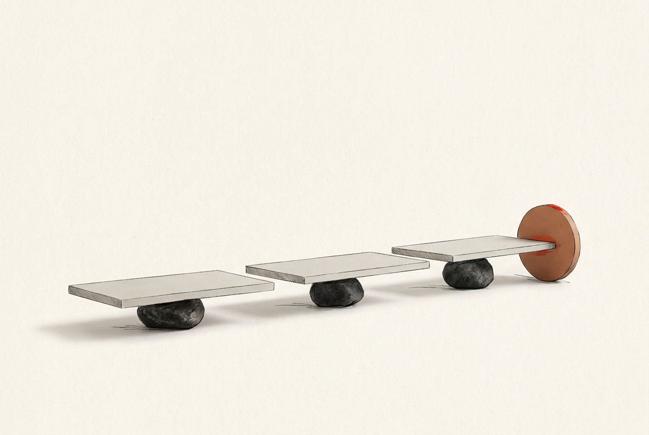
I don't treat proof as a testimonial strip added after the design is finished. I match evidence to individual claims. A claim about delivery speed needs a documented turnaround or an explicit service commitment. A claim about the quality of an audit needs a sample finding. A claim about commercial results needs an attributable case study with enough context to interpret the result.
Placement follows the doubt. I put a sample deliverable beside the explanation of what's included, and a relevant customer account near the outcome it supports. A row of logos might establish prior relationships, but it doesn't explain what changed or who did the work. Where permission allows, I prefer a named role, a specific problem and a clear account of the contribution.
I also distinguish evidence from promises. 'Delivered within five working days' is a commitment if it's part of the offer, not proof of past performance. If I don't have a suitable case study, I show the method, a labelled example or the actual deliverable instead. I never fill the gap with invented testimonials. A modest, verifiable claim is more useful than borrowed certainty.
Choose one primary action and explain the commitment
One clear action means one primary conversion goal, not necessarily one button. I may repeat the same action after the offer and again after pricing on a longer page. I avoid giving equal visual weight to booking a call, downloading a guide and subscribing to a newsletter. Those are different decisions, and presenting them as peers leaves the visitor to establish the priority.
Nielsen Norman Group's information scent framework helps explain why labels matter: people use the cues around a link to judge where it will take them. I prefer 'Choose a review slot' to 'Get started' when the next screen is a calendar. Nearby copy should disclose the duration, price and preparation required, where relevant. The destination must then honour those expectations.
I keep necessary supporting links, including privacy information and terms. One action isn't an excuse to withhold information. Baymard Institute's checkout research identifies unexpected extra costs and account requirements among reported reasons for abandonment. That's ecommerce evidence, not a universal landing-page conversion estimate. I use it to challenge avoidable surprises: disclose material costs and make account requirements clear before someone commits.
Design mobile layouts and forms for completion
I use visual emphasis sparingly: a clear heading hierarchy, readable text, sufficient contrast and one prominent button treatment. If every panel has a coloured background, a badge and an animation, nothing has much priority. On mobile, I check that the opening explains the offer without an oversized illustration pushing all useful information down. I don't force everything into the first screen.
For forms, I ask what each field changes about the next step. An initial enquiry might need an email address and a short description of the problem; a shipping address would need a separate justification. That isn't a universal field limit. Qualification sometimes requires more information, but I weigh its value against the effort and sensitivity of asking for it now.
I test the full route on a narrow screen and with a keyboard, including errors and confirmation. Labels need to remain visible after typing. Error messages should explain the correction without clearing valid entries. I also check whether sticky buttons obscure content or the on-screen keyboard. These checks take priority over entrance animations because they address whether someone can actually complete the task.
Measure qualified conversions, not just button clicks
I define success before publishing. For a consultation page, that might be completed bookings that meet agreed qualification criteria. For a purchase, it might be paid orders, with cancellations tracked separately. Button clicks are useful diagnostic events, but they aren't the outcome. A vague button can attract clicks while producing fewer completed bookings once visitors discover the price or commitment.
I track the path from landing-page visit to action click, form start and successful completion. Then I compare traffic sources and devices before blaming the layout. A campaign reaching the wrong audience can make a clear page look ineffective. I check the tracking itself too, particularly duplicate completion events and confirmation pages that can be revisited. Bad measurement produces very convincing wrong answers.
I change the weakest part of the decision path first. If visitors start the form but abandon it, I inspect the fields, errors and newly revealed conditions before rewriting the headline. With little traffic, I favour observed usability sessions and customer questions over declaring a split-test winner from a handful of conversions. I record the change, the expected effect and what would count against it.
Questions people ask
How long should a landing page be?
I make it long enough to explain the offer, support its claims and resolve practical objections. An unfamiliar, expensive service usually needs more explanation than a familiar product. I cut repeated persuasion before cutting useful detail.
How many call-to-action buttons should a landing page have?
I use one primary action and repeat it where the page length justifies another opportunity to act. Two buttons leading to the same booking flow don't create two conversion goals. Competing destinations need a clearer hierarchy.
Where should testimonials go on a landing page?
I place testimonials near the claims or concerns they address. A comment about clear communication belongs beside the working process, not automatically at the bottom. I include attribution where permission allows and avoid quotations so general they prove nothing.
What is a good landing page conversion rate?
I wouldn't set a target without knowing the traffic source, offer, price and conversion definition. I establish a baseline for the page's actual goal, then compare like-for-like traffic. A higher enquiry rate isn't useful if fewer enquiries become suitable customers.