2026-09-10 · 7 min · By Alcott Dube
How to prepare artwork for print: colour, bleed and proofs
I treat print artwork preparation as a production check: agree the colour settings, build enough bleed, inspect image resolution and approve a proof that matches the job.
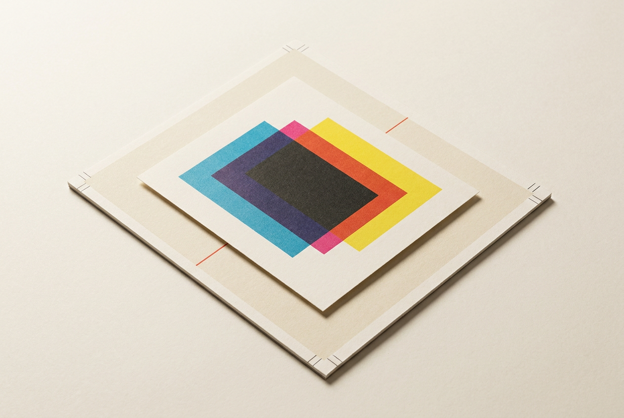
I prepare artwork for print by confirming the printer's specifications, setting the correct colour profile, extending artwork beyond the trim and checking image resolution at its final size. I then export the requested print file, inspect it for production errors and approve a proof appropriate to the paper, colour requirements and cost of a reprint.
What to ask your printer before preparing artwork
I start print artwork preparation with the printer, not the export dialogue. The production method and paper stock affect almost every decision that follows. A short digital run on uncoated paper needs different expectations from a lithographic brochure with a separate spot ink. I ask for the printer's specification before setting up the document.
My minimum brief covers the finished dimensions, page count, binding, stock, colour process, bleed, safe area, preferred output profile and accepted pdf standard. I also establish who handles colour conversion. Some printers want converted cmyk artwork; others prefer tagged source colours in a managed workflow. Guessing can mean converting the same image twice.
For a folded leaflet, I request a folding template. For packaging, I request the approved cutter guide and instructions for separating it from printable artwork. I don't make panels equal by default: a fold-in panel may need to be narrower. These are structural decisions, not details to repair after approval.
Should print artwork use rgb, cmyk or spot colours?
I keep editable originals with their colour profiles attached. Rgb describes colour through light; cmyk uses process inks, with results constrained by the press and paper. Some bright screen colours cannot be reproduced in process printing. Switching a document to cmyk doesn't automatically make its colour accurate, especially if the selected profile describes the wrong printing conditions.
When the printer asks for cmyk, I convert using its specified destination profile and inspect saturated colours, shadows and neutral greys. Assigning a profile changes how existing colour values are interpreted; converting changes those values to preserve appearance as closely as possible. I don't treat the two commands as interchangeable.
Pantone distinguishes process reproduction from printing with specified spot inks. A Pantone swatch in the file doesn't guarantee a separate ink on press; the job must be quoted and produced that way. I confirm the intended ink and stock with the printer. Coated and uncoated references aren't interchangeable appearance targets, and a screen simulation isn't a physical ink sample.
How much bleed and safe margin does print artwork need?
Bleed is artwork extending beyond the finished edge so small cutting variations don't leave a white sliver. I often start with 3 mm for small-format work, but only as a provisional setting. The printer's specification wins. Large-format graphics, mounting and some binding methods can require different allowances.
For a 210 × 297 mm page with 3 mm bleed on every side, the artwork must extend across 216 × 303 mm. The document's trim size remains 210 × 297 mm. I extend photographs, backgrounds and edge-touching shapes into that area. Adding bleed during export doesn't create missing image content.
The safe area sits inside the trim. I keep essential text, logos and page numbers away from the cut and allow extra room near binding or folds. A 5 mm internal margin can be a starting point, not a guarantee. Adobe's guidance separates bleed from printer's marks; I add crop marks only when requested, using the printer's required offset.
How to check image resolution at the final print size
I check effective resolution at the placed size, rather than trusting the number stored in an image file. A photograph at 300 pixels per inch becomes 150 pixels per inch when enlarged to twice its original dimensions. Changing the resolution label without adding useful detail doesn't repair a soft image.
For close-viewed brochures and stationery, 300 pixels per inch at final size is a common starting target for photographs. A 1,800-pixel-wide image supports 6 inches of width at that density. Posters viewed from several metres away may need less. I ask the printer before rejecting a large image solely because it falls below 300.
I keep logos, type and simple diagrams as vectors where possible. Raster line art may need more resolution than a photograph to preserve crisp edges. I also check focus and compression damage: enough pixels can still describe a poor image. Enlarging a web thumbnail is rarely a sound production decision.
How to check black text, overprint and fine details
I normally set small black text in black ink only, rather than a four-colour mix. Slight registration differences between plates can make mixed black text look fringed. For a large black background, I ask for the printer's preferred rich-black build and total ink limit instead of borrowing a recipe from another job.
Overprint needs inspection because it changes how overlapping inks behave. White objects set to overprint can disappear from output. Black overprint can be intentional, but it shouldn't be assumed correct everywhere. I use overprint preview and inspect separations, especially around reversed text, logos and coloured backgrounds.
Fine rules and small reversed type depend on the process and stock. I ask for minimum line weights and type guidance when the design pushes either. Absorbent paper can close up delicate details. Making a rule slightly heavier is usually a better compromise than relying on a perfect press result.
How to export and preflight a print-ready pdf
I run a document preflight before export. Adobe's InDesign guidance describes checks for problems such as missing fonts, missing or modified links, overset text and insufficient image resolution. I configure those checks around the actual job. A default profile can't know the intended bleed, approved spot inks or agreed production limits.
I use the printer's requested pdf preset. Pdf/x-4 supports live transparency and colour-managed content, but it isn't a substitute for agreement with the printer. I export single pages unless spreads are explicitly requested. Imposition, the arrangement of pages for printing and binding, normally belongs with the print provider.
After export, I open the actual delivery file and check its page count, dimensions, bleed, fonts and separations. I inspect transparent effects and any artwork crossing a fold. I don't outline all text by habit; embedded fonts are generally preferable when supported. If native files are required, I package the links and share fonts only where licensing permits.
Which print proof should you approve before production?
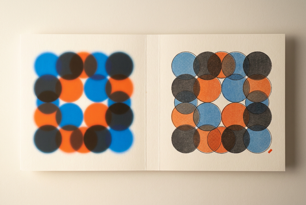
I choose the proof according to what could go wrong. An emailed pdf is useful for checking wording, page order, missing elements and visible layout changes. It doesn't establish how ink will look on the chosen stock. A folded paper dummy can reveal awkward pagination or fold placement without proving colour.
For colour-sensitive work, I use a calibrated, profiled display and soft-proof with the intended output profile. Adobe's proofing guidance explains how this simulates another output condition. Paper and black-ink simulation can expose reduced contrast, but a display can't reproduce every property of printed material. I don't approve a difficult brand colour from an uncalibrated laptop alone.
When colour failure would justify a reprint, I ask what physical proof is available and what it represents. A contract colour proof may simulate the intended process; it won't necessarily reproduce spot inks, foil or paper texture. I confirm those separately through samples or production tests. Then I record the approved filename, proof type and date. Any later artwork change needs a fresh check before release.
Questions people ask
Can I send rgb artwork to a printer?
Yes, if the printer accepts it and manages the conversion. I confirm the workflow and keep profiles attached rather than assuming every printer requires pre-converted cmyk files.
Is 300 pixels per inch always necessary for print?
No. I use it as a common starting point for close-viewed photographs, but final size, viewing distance and printing method determine the requirement. Vector artwork doesn't have a fixed pixel resolution.
Do I need crop marks if my file has bleed?
Not necessarily. Bleed provides extra artwork outside the trim, while crop marks indicate cutting positions. I follow the printer's instructions because some workflows use the pdf's trim information without added marks.
Why do printed colours look duller than my screen?
A display emits light, while print reflects light from paper through ink. Some screen colours fall outside the printable range, and stock affects contrast. I check the output profile and proof before changing the artwork.